
Multidisciplinary Designer.
UX Design
Web Design
Art Direction
This is the story of Boebody’s website. It covers major design decisions made over the past year as well as some little ones that impacted conversions.
Boebody is a brand that takes a new approach to shaperwear and invisible breast support, making it fun and unapologetic.
Done at CreativeDisorder agency.
Boebody is a brand that takes a new approach to shaperwear and invisible breast support, making it fun and unapologetic.
Done at CreativeDisorder agency.
Up until this time, Boebody’s site was a hacked together Shopify theme with Shopify’s back end connected, but the seams were starting to split and it was feeling less and less scalable. Everything was manual and required many sleepless nights to keep things held together.
I’ve updated the website typography from using three fonts to using one single font (Ploni) with a variety of weights and widths. I’ve also created a Figma style library, that included everything from buttons, forms, modules, and sections and made sure to include all of the various states.


The existing website was great but we quickly faced our next problem: How do we tell our full brand story on our website? We had no idea if customers were coming back and why. We had some early adopters but knew that we couldn’t rely on that audience forever. We didn’t want the brand to be all about “girly” fun feeling but about making Boebody an actual source for everything a woman needs to feel comfortable in her clothes.
A feeling of flow that was unprecedented.
How do we do that? This is where the work began.
We talked with users, connected through social media, and refined our message until we felt like we knew who we were and who we were talking to.
How do we do that? This is where the work began.
We talked with users, connected through social media, and refined our message until we felt like we knew who we were and who we were talking to.

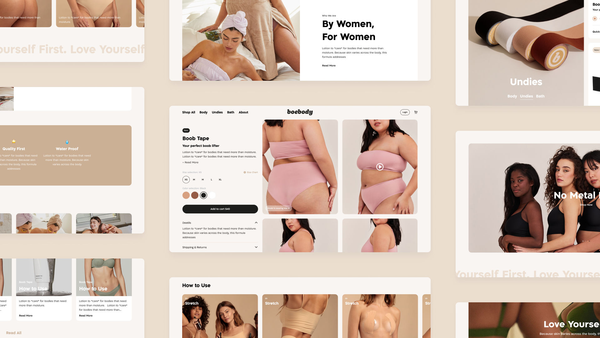
I packed up that info, explored lots of design directions, revamped the site, and in late 2021 launched the website that truly sought to position Boebody as a solution to female shapewear & underwear. The whole experience was made mobile first.
To educate users about the shapewear solutions, every product page includes a storytelling section, how to use the product correctly and how it looks in real life.
To educate users about the shapewear solutions, every product page includes a storytelling section, how to use the product correctly and how it looks in real life.
Since the product page was quite full of information, a floating CTA (mobile) was added. It allows users to take action whenever they're ready, staying close to their thumb. The storytelling content was all created by Boebody's community, further strengthening the community feel of the brand. The design, art direction, and development were all handled by me.

We reformatted the product pages to reduce sticker shock and decrease bounce rates. We also introduced add ons and other upsell opportunities to the site to increase the overall revenue per order.
The complications of e-commerce are unique. When done right users don’t notice how complex things are. There is still a lot to be improved on Boebody’s site. This project have been fast-paced and challenging. That being said, I’m proud of everything I’ve learned so far.
